Plates that Speak Before the First Bite

Harnessing Hue Psychology
Research into appetite shows reds and oranges can increase urgency and perceived warmth, while cooler blues and violets calm, slow, and refine attention. Use this intentionally: a ruby beet glaze beside creamy whites tells comfort; a jade herb oil whispers freshness without overwhelming the dish’s delicate aromatics.
Building Contrast Without Chaos
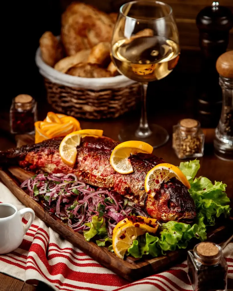
Contrast should guide, not shout. Pair complementary colors with neutrals so the eye rests between moments of intensity. A charcoal plate hugging saffron sauce makes grilled fish luminous, while scattered cucumber crescents offer cooling relief, creating rhythm, clarity, and a confident path toward the bite you want noticed.
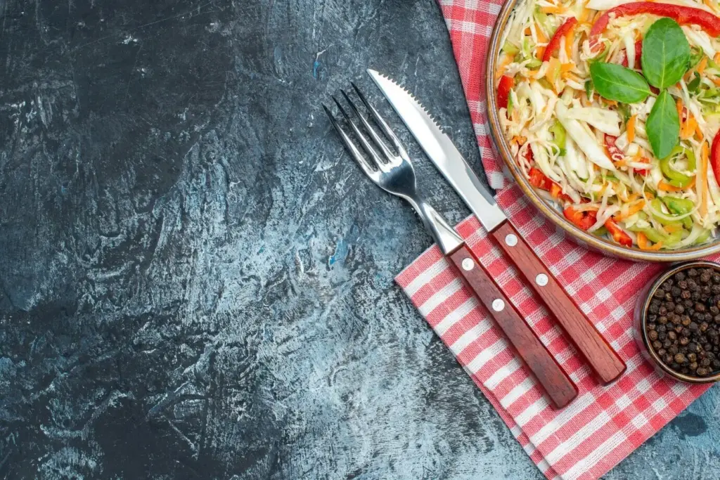
Natural Color from Ingredients
Lean on nature for vivid tones. Blanch greens to set chlorophyll, shock for gloss, and preserve snap. Roast carrots until sugars lacquer; whip yogurt for snow-white height. Edible flowers, citrus zest, and pomegranate arils add honest brightness, ensuring beauty supports flavor rather than decorating without purpose.
Composition, Balance, and Intentional Space

Stack with Purpose, Not Pretense
Textural Peaks and Valleys
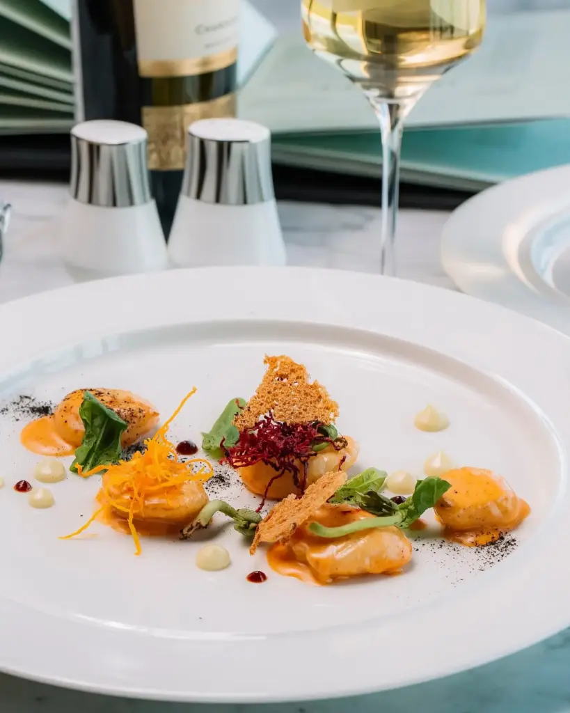
The Hidden Architecture
Sauces, Gloss, and Finishing Sheen
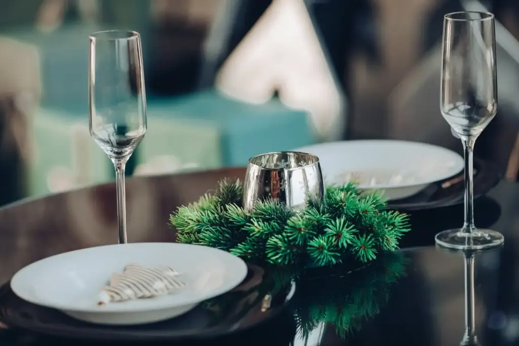
Plateware, Lighting, and the Setting
Choosing the Right Canvas
Consider contrast between plate and food, weight in the hand, and how surfaces affect sauce behavior. Speckled stoneware implies rustic comfort; slick porcelain reads modern. Let the story dictate the canvas, ensuring the first glance communicates intent without stealing attention from aroma and generosity.
Light as an Ingredient
Angle a lamp to carve highlights along sear marks and preserve shadows underneath delicate leaves. Soft, warm light feels intimate, while crisp, cool beams suggest freshness. Adjust intensity so reflective sauces gleam pleasantly, not harshly, guiding eyes toward the exact textures you want celebrated.
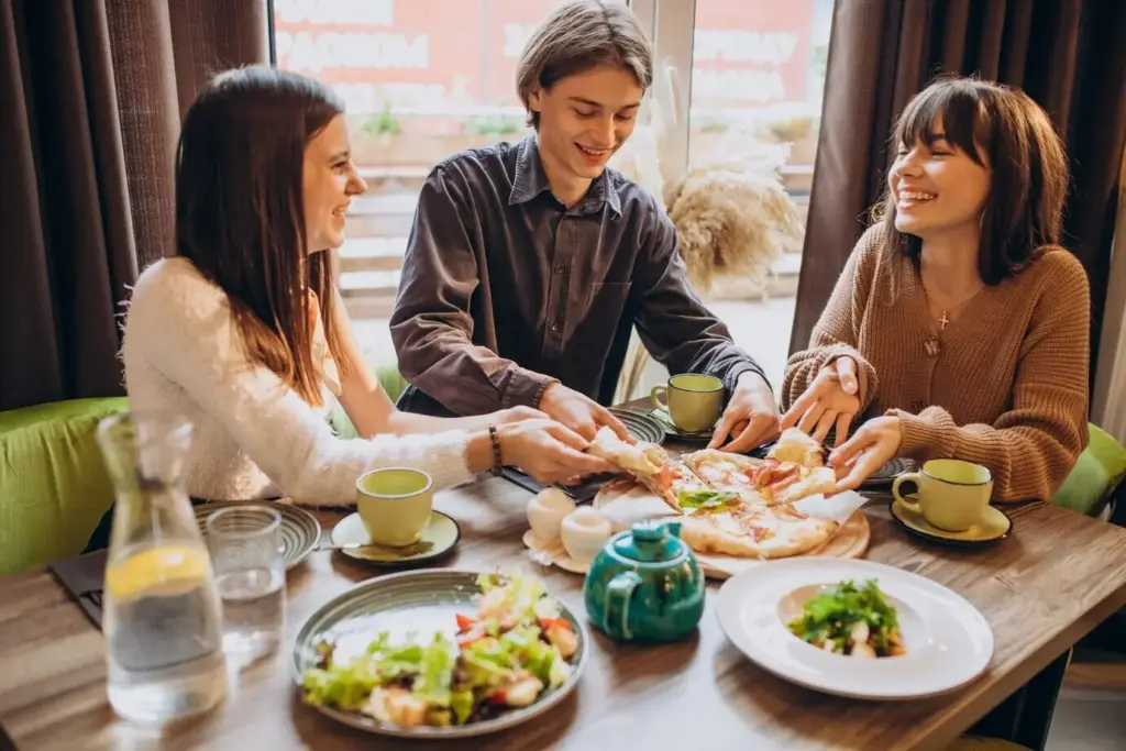
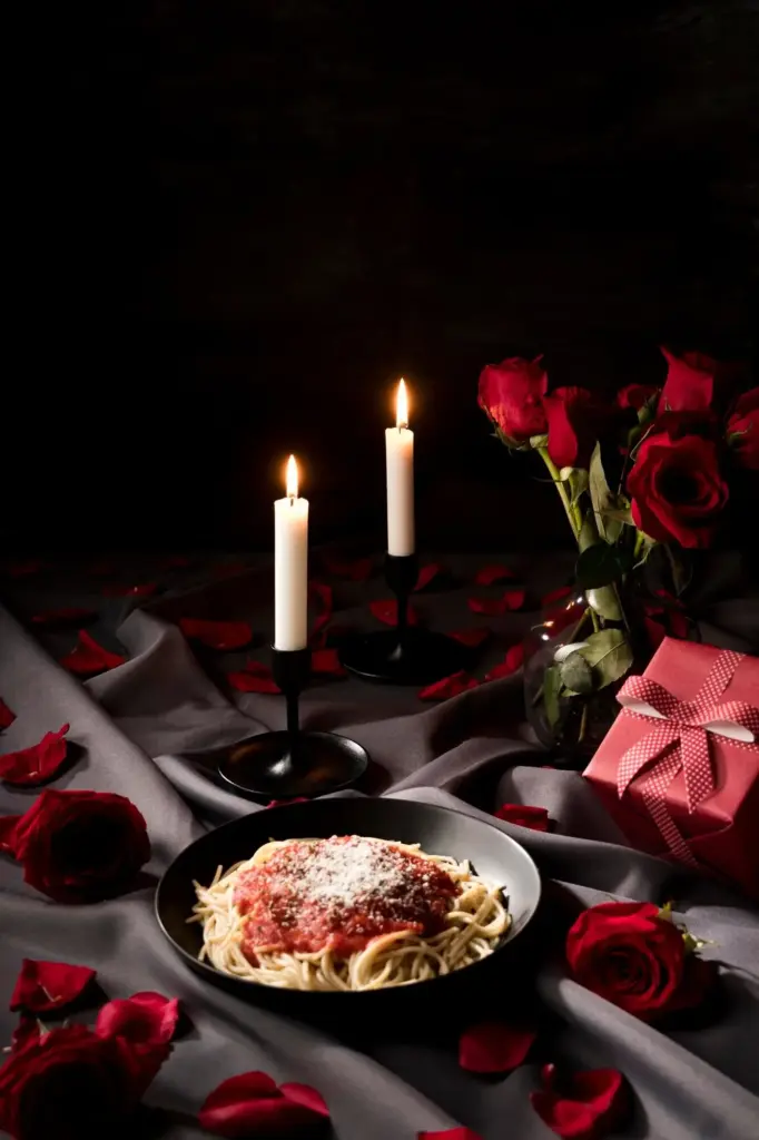
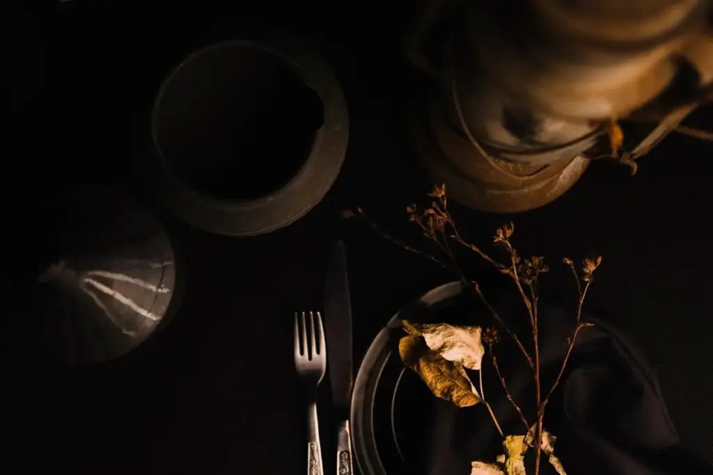
Warmth, Ambience, and Expectation
Table context shapes appetite. A linen with gentle texture, unfussy cutlery, and a low candle suggest comfort and calm, encouraging slower chewing and clearer tasting. Even a home weeknight can glow when subtle details promise care, thoughtfulness, and a generously paced conversation.
Storytelling, Memory, and Emotional Appetite
Seasonal Signals that Whisper Freshness
Cultural Motifs with Respect
An Invitation to Respond
All Rights Reserved.